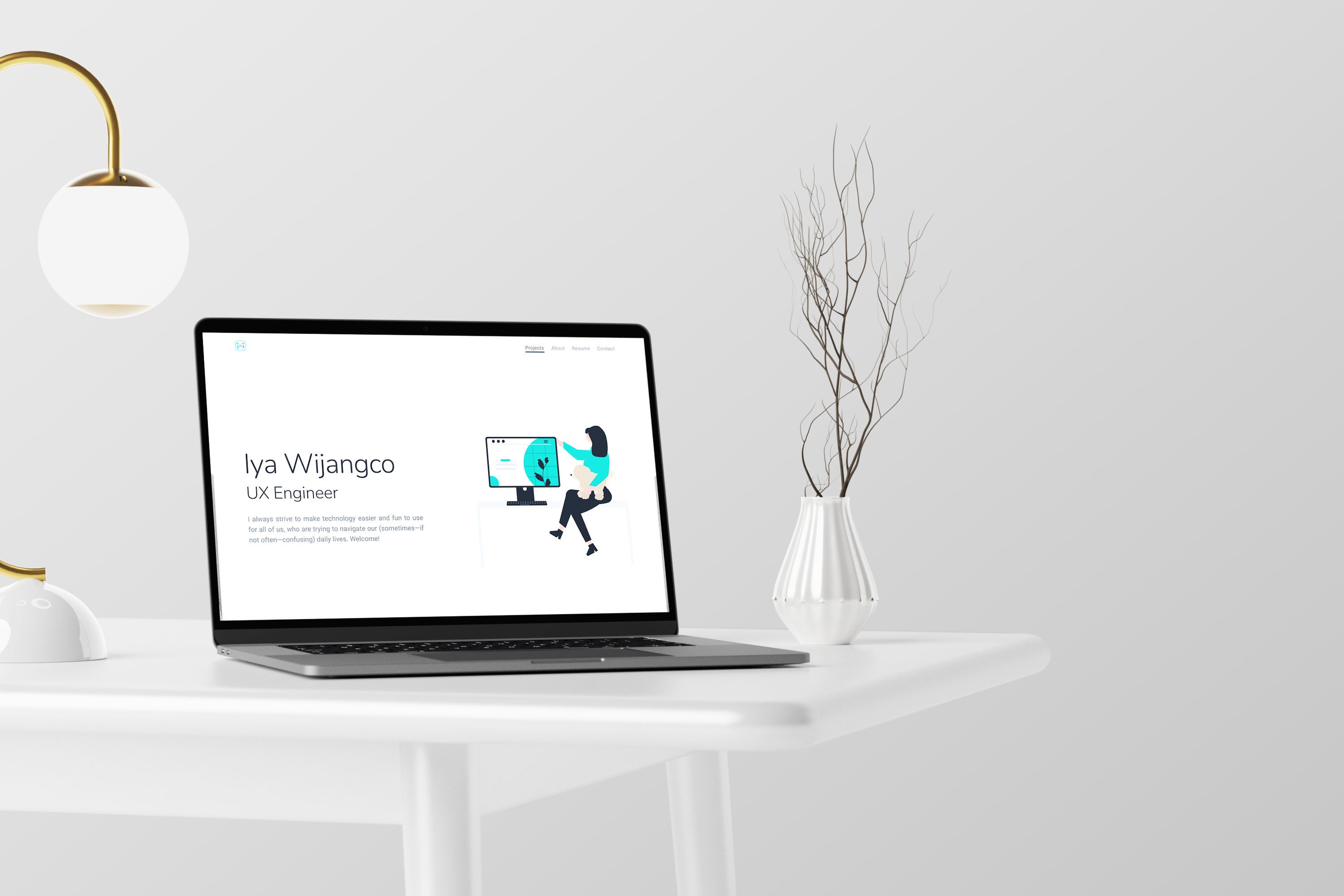
Iyawi
Walkthrough of my general design process while creating this portfolio website
Type
Web Application
Role
UI/UX Designer
Front-End Developer
Tools
Figma
Photoshop
Krita
NextJS
Key Skills
User Research
Wireframes
Prototyping
Branding
Visual Design
Vector Art
Web Development
Design Process
Basic structure to help designers solve problems more effectively
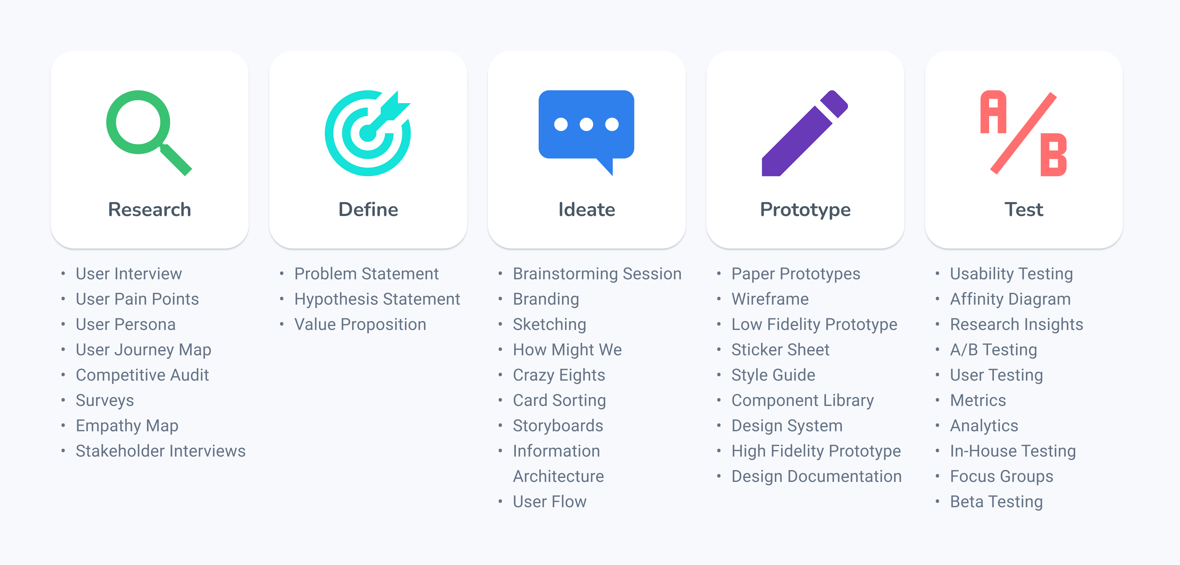
Different projects require different design frameworks, but here's an iterative non-linear design process that I usually follow when designing applications. This is based on existing frameworks like Design Thinking and User Centered Design Process. Like all design frameworks, I try to put the user front and center while making sure the design is ethical and inclusive. I use a variety of tools and methods depending on the scope and challenges of a project.
Designs can always improve with each feedback we get from a user. So as much as possible, I try to get feedback from an end user every step in the design process to create a better experience. After getting input from end users, it is also important to consider stakeholder feedback to balance user and business needs.
Research
Empathizing with users
Understanding the needs, behaviors, pain points, perspectives, and motivation of end users is crucial in creating a good user experience.
To avoid biases and assumptions, I conducted secondary research on the end users of portfolio websites. This allows me to anticipate and predict what my end users might think and feel as they interact with my product. I researched people who usually review portfolios including heads of design, hiring managers, front-end developers, and creative directors. They sift through hundreds of portfolios, so they want to see brief, compelling and cohesive case studies.
I also ran a competitive audit involving portfolio websites made by Google UX Designers and top portfolio websites listed in Youtube. I want to communicate simplicity and efficiency, like the Material Design System, so I looked at websites that showcase that particular style for inspiration.
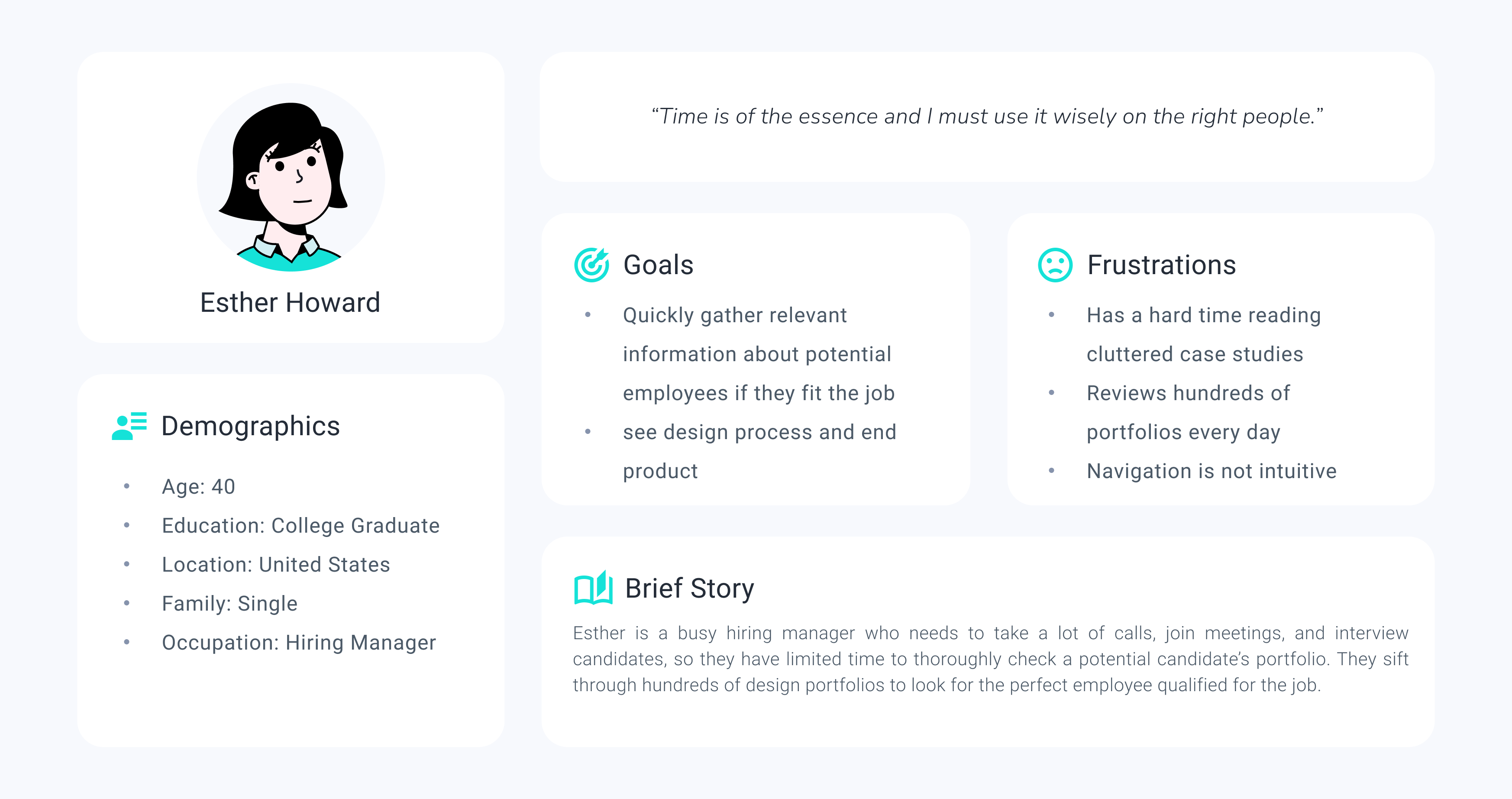
User Persona of a Hiring Manager
Define
Identifying an actionable problem statement
The Problem
How to make a stellar portfolio that shows off my skills in design and engineering to land a job?
Ideate
Brainstorming solutions
I made an information architecture that tries to organize the information and features that can help solve the frustrations of hiring managers. This will be used as a guide for the general layout, interactions, and functionality of my prototype.
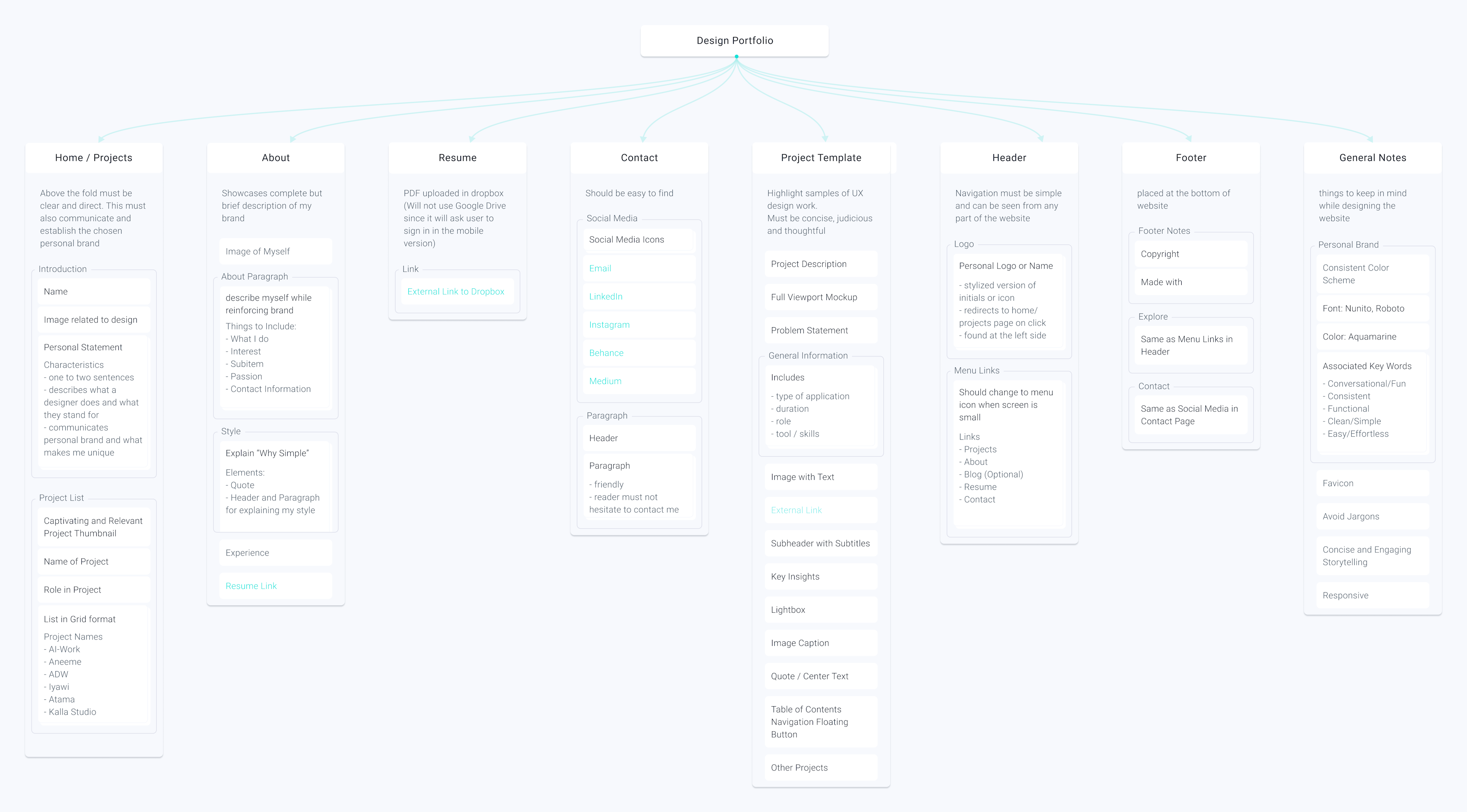
Information architecture of my design portfolio website
Design System
Typography, Colors, Iconography, Shadows, Spacing, etc.
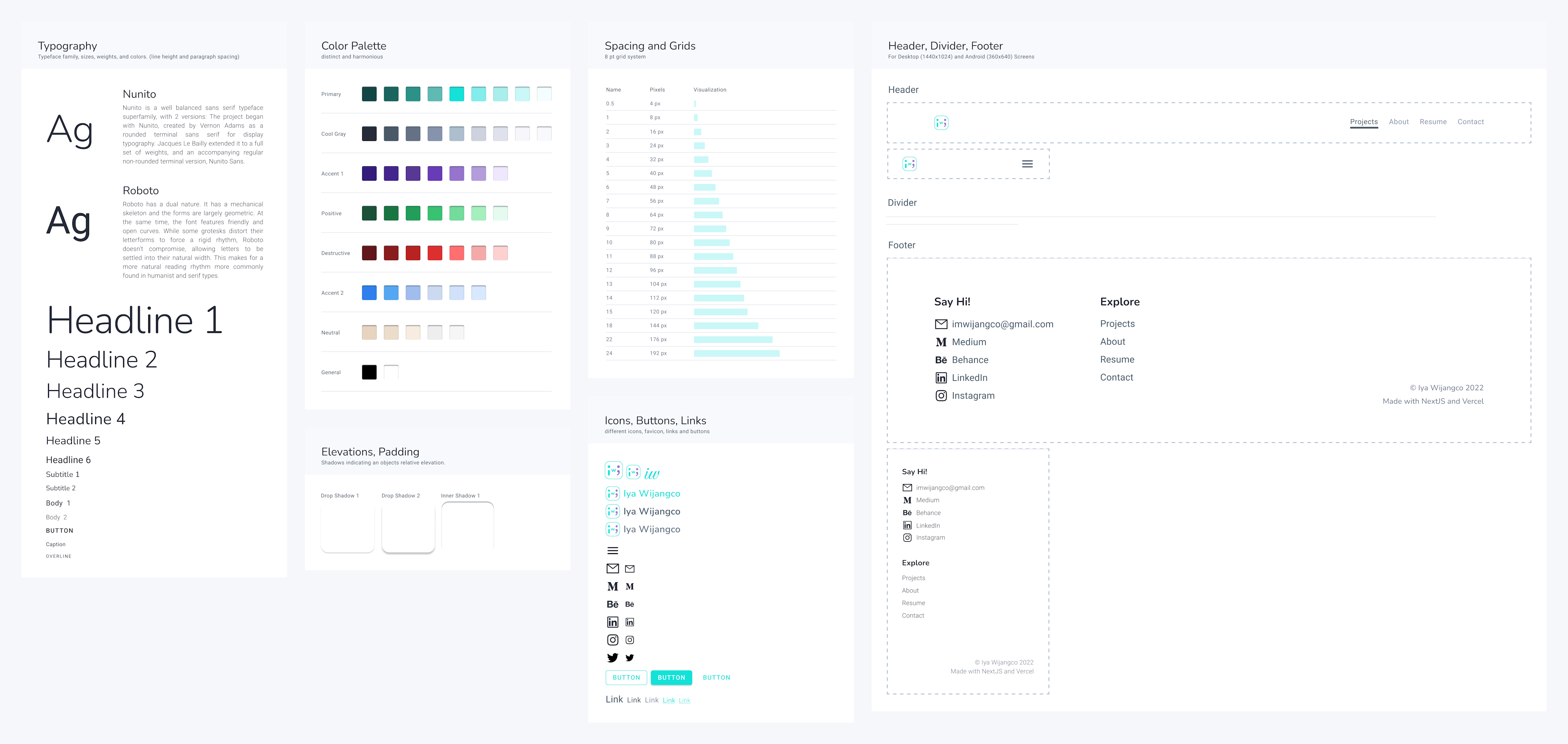
To establish my personal brand, I have carefully chosen the typography, tone, and colors for this project. The goal is to evoke simplicity, effortlessness, and fun.
With color psychology in mind, I chose aquamarine as my primary color, since it relates to ease and creativity. Roboto and Nunito are sans serif fonts that allow a natural reading rhythm, and are perfect for effortless reading blocks of texts. For the microcopies and storytelling, I chose to make it sound human and friendly to align with my conversational brand voice. The layout and grids for this project also take into account responsiveness and optimal line lengths for easy reading.
To capture my interests in psychology, games, and programming, I created a personal logo from scratch with my initials. This is inspired by gameboys, emojis, and BMO.
Prototype
Creating a model of a product that demonstrates its functionality, flow, and goal

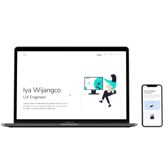
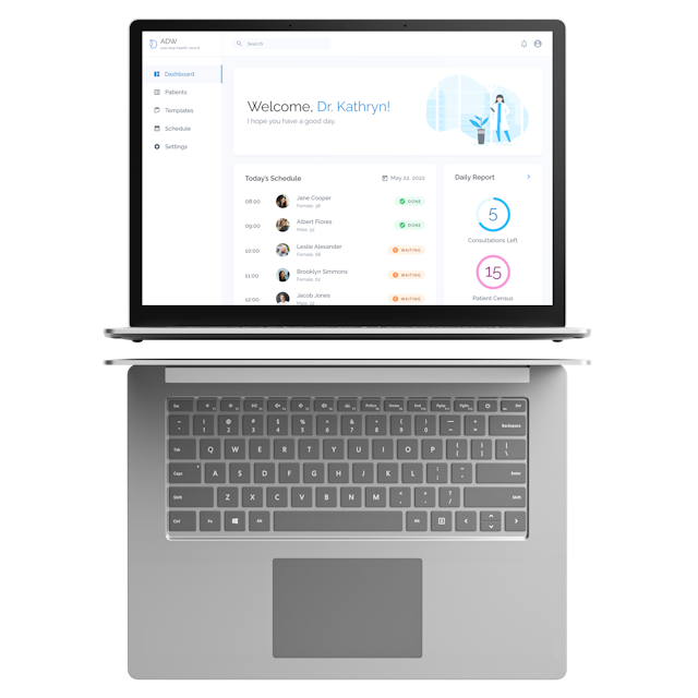
High Fidelity Prototype
Designing isn't a rigid process. Tools such as wireframes, user flows, low and high fidelity prototypes should be used only if they can give the most clarity in product creation. Armed with a deep understanding of the goal, elements, layout, and how the pages interact, I created a high fidelity prototype instead of creating wireframes first. High fidelity prototypes simulate the look and feel of a product, without actually building the website. With this mockup, I can immediately test if the visual elements communicate the personal brand I wanted to show.
Testing
Getting user feedback
After designing the high-fidelity prototype and translating it to code, I conducted an informal usability testing where I let five people use my website, observed what they did, and documented their feedback. After each test, I quickly presented a design with their feedback incorporated and interviewed them again about which design felt better for them. Here are some design iterations I made after conducting a usability test.

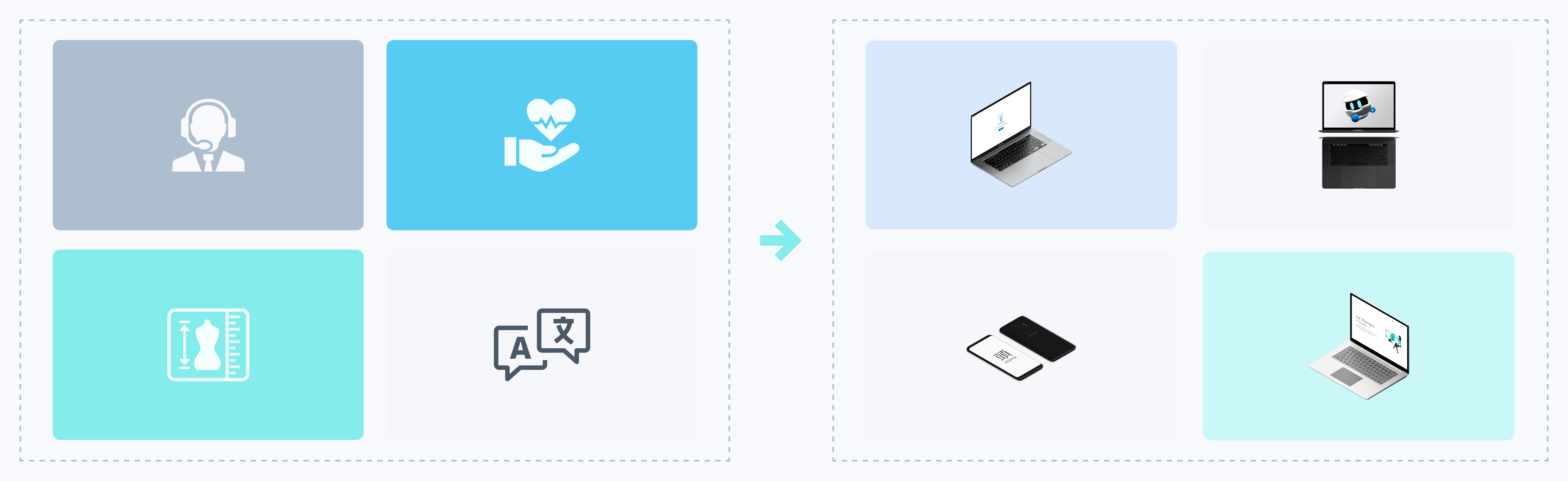
Changing the Project Card Thumbnail
To make the project card more captivating and relevant to the context of the project, I changed the vector graphic icons to thumbnails, with home page previews rendered in their respective devices.

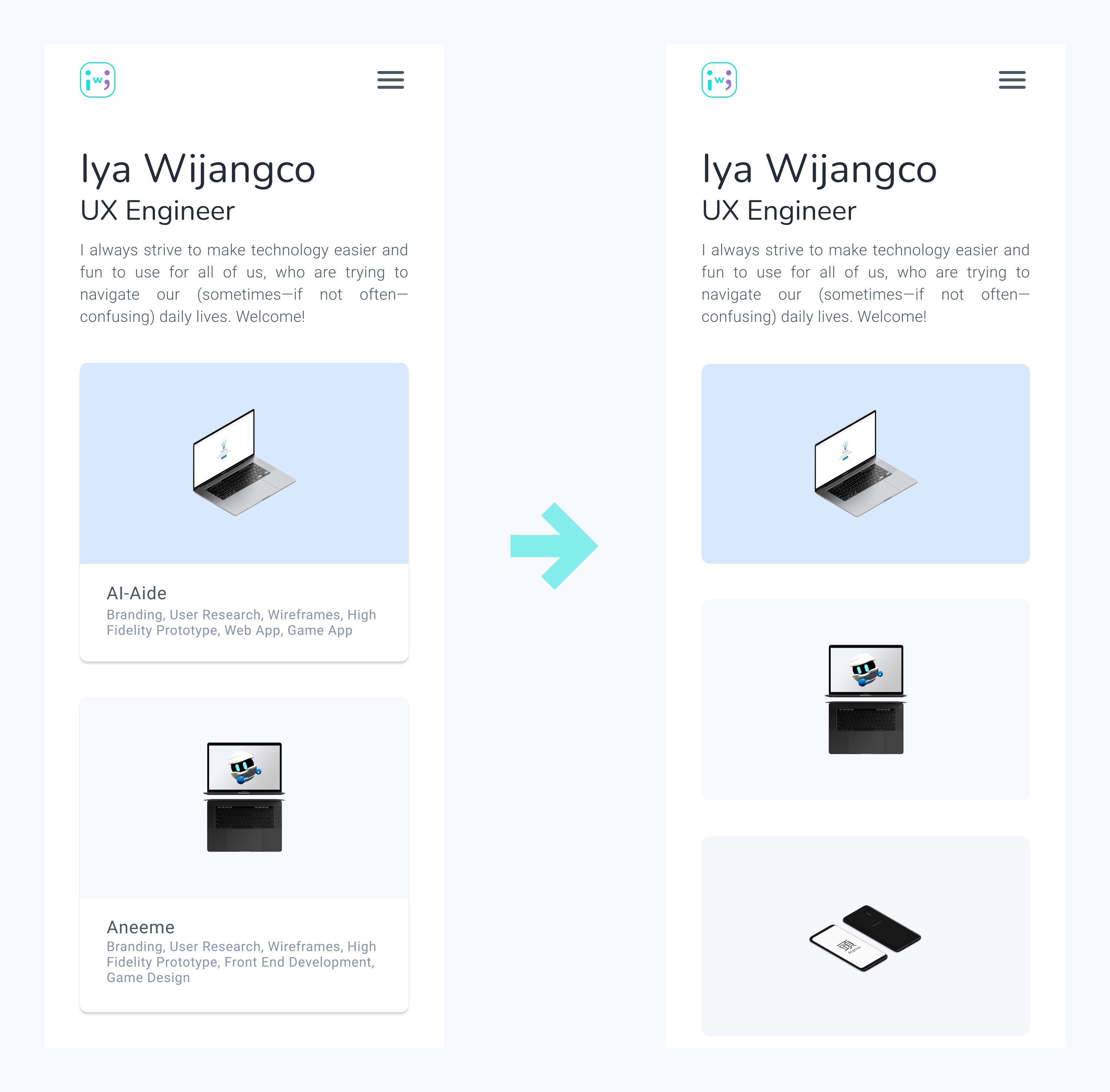
Project Card Details
A user needs to hover on a project card before seeing the details in the web version, while the project card for the mobile version should have its details immediately seen. Hovering (press and hold) in mobile is not intuitive for users. However, due to time and development constraints, the mobile and web project cards are the same, and I am still working on this feature.

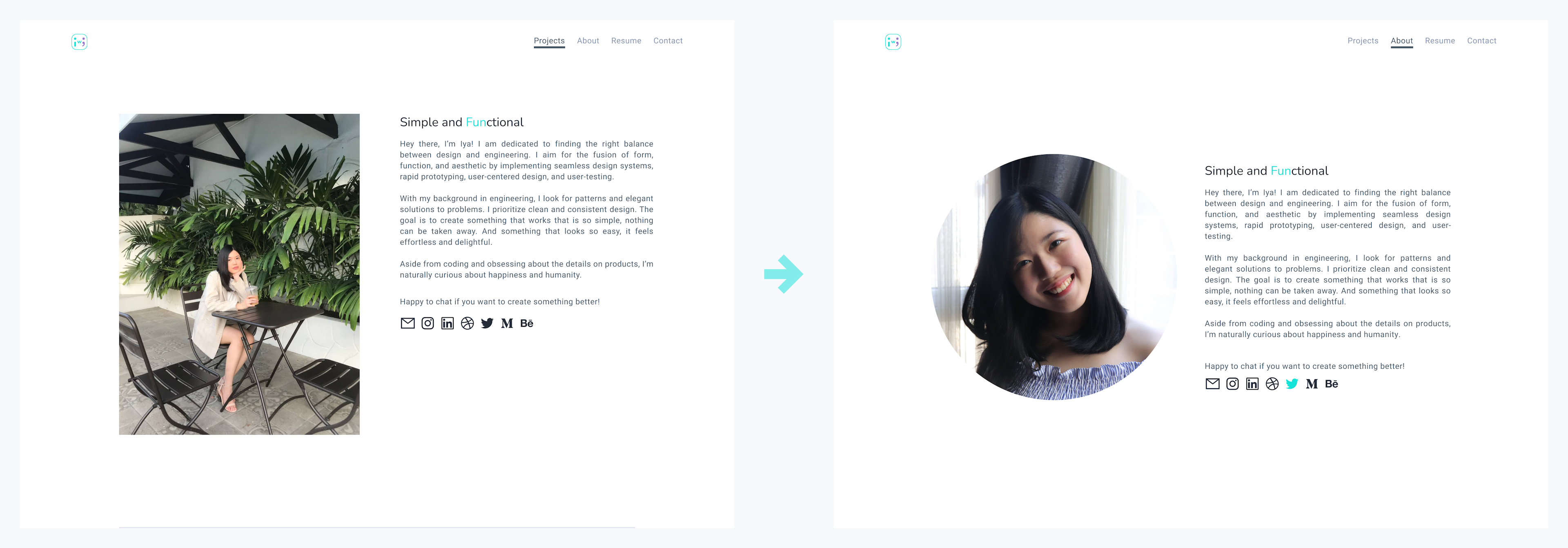
Formal to Casual Image
After researching common layouts of portfolio websites for my competitive audit, I initially used a rectangular frame for my image in my about page. One user told me that my chosen image should look more vibrant. With that in mind, I used a circular smiling portrait, since I’m going for an approachable and fun branding.

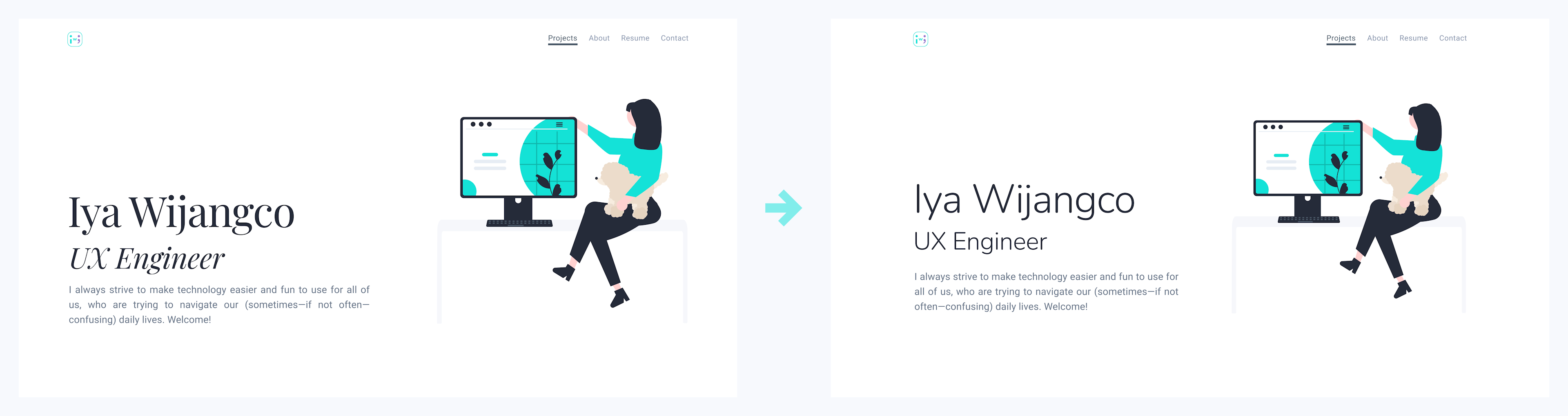
Sans Serif to Serif
I found that users tend to favor both display and body texts in sans-serif typefaces. Sans serifs are easier to read so I went with Nunito. Playfair Display was my first choice, which I think is more elegant than casual.

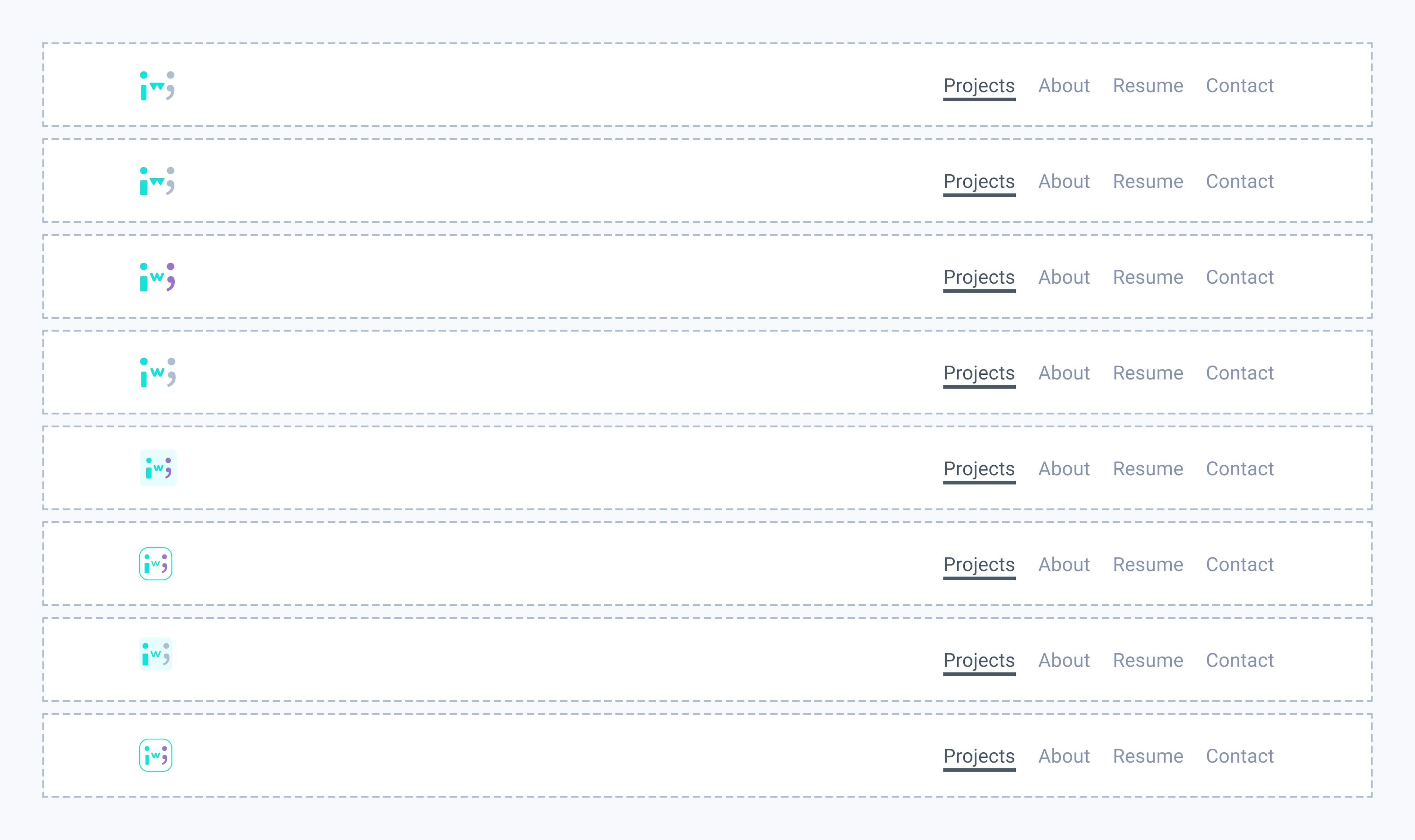
Logo Testing
I personally designed my own logo, and came up with several versions. I asked different people about their opinion on a narrowed down selection of my designs. Most of them expressed preference for my present logo.

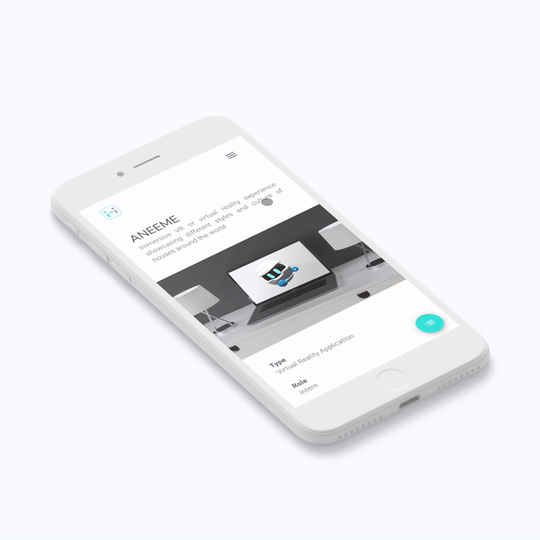
Table of Contents and Case Study Navigation
One user suggested that she wanted to quickly navigate to a section of a case study, instead of scrolling back to find what she’s looking for. To address this problem, I made a floating button for the table of contents. For better user experience, the floating button hides itself when the user scrolls down, so it doesn’t obstruct the view of the user.
Key Insight
Designers tend to get overly passionate and attached to their designs and I’m no exception to this. But when designing this web application, I try as much as possible to be emotionally distant from my work and ask for critiques to create a better portfolio. Feedback and criticism from my testers have helped me get more creative with the constraints. This also prompted me to view some problems in a different way and this helped me come up with designs I would not have thought of in the first place. The constant feedback has made the A/B design decision-making process more efficient. And for that, I’m really thankful to all the people who helped me and for the invaluable lessons of listening and flexibility.
